Wednesday, 7 December 2011

The Evacuee - December 2011 Animatic

Here is the finished for hand in version of my groups animatic. I am pleased with the outcome and think that the pacing works really well. It was boarded and put through Storyboard Pro by myself and Sound was designed and edited by David McDonald.


My Vimeo : Click here

Monday, 5 December 2011

The Evacuee - Final StoryBoards

Here are the final boards that I have worked on. Really pleased with how professional this looks and working on Storyboard Pro really helped.
Evacuee Storyboards

Friday, 2 December 2011

Animated Exeter 2012 Ident Animatic Pitch


Our idea is Indiana Jones meets the Flintstones. Taking the adventure and charisma in Indy and crossing that over with the whole idea of the Flintstones’ opening sequence where we follow him on his eventful and fun journey. But also using the character animation style of the Flintstones, which complements the Greg McLeod’s original design of small fast legs and bulky bodies. For the soundtrack we are going to take ordinary jungle sounds like birds and other exotic animals and distort them to give it the same quirkiness of the original illustration. The whole thing is going to be produced in CGI but using tools and effects to make it mirror the illustration in terms of colour and look. As of this pitch we have a core of 3 people working and if chosen we have others ready to get involved.


My Vimeo - Click Here

Wednesday, 30 November 2011

Winter Life Drawing

Here are a few of my pieces that I did this evening. We worked with on of the Post-Grads Gaz . He gave us some interesting and dynamic ways to work. I really enjoyed it and it was nice to spend some time looking more on shape and volume of the figure. Which will help in both 2D and 3D.


Sunday, 27 November 2011

Posing Max

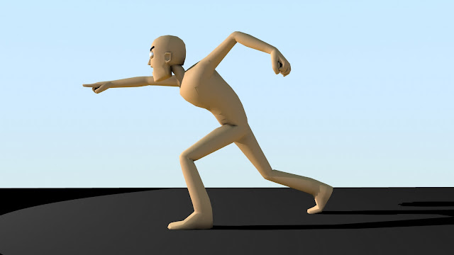
As a little simple exercise I took a rig from the web and messed around with it. It's nice to get back into Maya and think about keyframes and pushing character poses. Even if the facial rigging here is not the best.   


Thursday, 24 November 2011

The Evacuee Animatic - WIP

As part of my group project I have been working on the storyboard for our short. It was fun working from Dave's Script and developed a storyboard from it. I think that the pacing works really well. Even though this is not the final version as it still needs to have added voices and sound FXs it still gives you a good feel for the piece.

The StackHouse Pitch

So through our Pre-Produtcion unit we have been working up to creating a pitch to perform infront of some in industry. I was really pleased with how my pitch went. I was a little shaky at first but I began to get into it and I am proud of how it looked in the end.

Plus the feed that was given back afterwards was really helpful and I look forward to applying it to when I have to pitch in the 3rd year.

Here is the PDF of the pitch that I used. It showcases the art style and a few pieces of concept art as well. The Stackhouse Pitch

Wednesday, 23 November 2011

Life Drawing...

My only Drawing that I felt that I was proud of. Going to focus more on portait work next week. 


Tuesday, 22 November 2011

Animated Exeter 2012 Ident Pitch - Colour Concepts

Some quick colour concepts that I wanted to illustrate how the difference between the jungle and the moster belly in terms of colour. Might develop this into a colour script.


Animated Exeter 2012 Ident Pitch - Rough stages

Our year has been given the great opportunity to work on the upcoming Ident for Animated Exeter. A few of us have split into groups and are now working on our own pitches to show at the end of this month. I have been working with Marc and Omari to develop an idea. Marc pitched it to me as the introduction to the Flintstones meets the chase scenes of the great Indiana Jones films. We worked on from the image that was given to us by the festival and was created by the incredible Brothers Mcleod. Here is the great piece of art.
So we did some concepts and roughed out a quick storyboard of how we are intending it to look. Rough Boards As I created this in ToonBoom Storyboard Pro I was able to create a simple animatic in a matter of seconds. Proving that our story and action can fit into the time contraint of 30 secs. A tough ordeal but I think it works really nicely.


After showing this to Andy he was impressed our progress and I look forward to hear how the pitch is received.

Thursday, 13 October 2011

Life Drawing - 2nd Year

Here are some of the pieces I got to do in the first life drawing lesson of the term. It was great to get back into the swing of drawing with both quick poses and some longer ones too. I can't wait until the next session. I might try and bring some more art materials. 


Wednesday, 12 October 2011

Pre-Production Project - Research


So I've hit the ground running and started work on my 1st project of the year. My Preproduction Project where I was given the follow details for my own personal brief;

Genre - Cooking Programme 
Character - Tin Toy(s)
Location - New York 
Style - John Vassos

I was very excited about this opportunity to develop a design bible around these constrictions. So as I begin the research phase I have started to look into books on both John Vassos. Who I have no clue about so it should be interesting to see how that works out. Plus I have taken some books out on the art of Tin Toys. Which I have found to be fascinating to read. The indicative style that these toys had of the countless years they have been around is incredible. 

But I thought I would quickly show you my beginnings of my research book and I look forward to it being full of interesting ideas and drawings and facts about all the various aspects of my project. 


Tuesday, 6 September 2011

Woman of Strength and Beauty

I am really pleased with some of these drawings. Iv'e been trying to focus on putting more detail and emphasis on the eyes so that the emotion comes across in a somewhat theatrical way. Which in animation is key in geting the mood across.


Tuesday, 23 August 2011

SummerTime - SteamPunk and Wolfie Times

So i've been neglecting my blog over the summer which I am sorry for. But I have a load of new drawings to post up so here are a couple to get you guys started. Here is a man desginned in the style of almost steampunk with a medic look to him. I based it loosely on the style of artist Mr.Mead Who's work you can see if you click here


The next drawings were a request from a friend to do something wild. I think I captured a good sense of the wild in these too images with the slightly anthropomorphic look that he has. I'm really proud of the body pose too.


Wednesday, 29 June 2011

The Portraits Sessions

As the first year draws to a close I've been keeping myself busy with a few portrait projects. Varying the styles between them some are very impressionistic and some are pretty realistic for my capabilities . I was also trying to get used to painting with watercolours again. Which was fun. I hope to do a few more if people like them.


This final one was a Self portrait I did in the style of Jamie Hewlett who is most known for his work for the band Gorillaz. I really liked doing this. Although it doesn't really look much like me.


Saturday, 18 June 2011

Character Design for King's Speech Animation

To keep myself Busy While the year begins to draw to a close I though I would give myself a small flash project. So I took the latest bit of 11 second club audio and have started to try and see what I can do with it in flash. I think they are looking good. I think they just need a little work to help them emote full when I whack them into flash.


Wednesday, 15 June 2011

Say Yes, Say No. Title Sequence

Well it's here in all it's glory and I'm pretty proud of what my group has managed to achieve. It has its highlight and also some bits that could have done with a little more tweaking but overall I am happy with the finished result and hope everyone enjoys it.


Say Yes Say No. Title Sequence from Ted Whitehead on Vimeo.

Wednesday, 8 June 2011

Parrots and Popstars

Here are a few pieces of art I am pretty pleased with. The First was based up the cover of the friendly fires new album "Pala" I wanted to draw a Parrot with a bit of personality.


Tuesday, 7 June 2011

Say Yes, Say No. Teaser - The Clouds.

Just a quick peek of the model I've been working on for my group. It's coming along perfectly and can't wait to see how it all falls into place.


Monday, 6 June 2011

Blood, Sweat and Tears

So I've been doing some more pre-production work rolling up to the point where I can take this baby into the studio and film it. I think it's coming along nicely and looks better than the small cardboard model that I started with. The scale helps. Plus the fact I managed to cut my finger open whilst cutting the card on one layer makes the project even more meaningful. seeing as I've poured my blood sweat and tears into this baby.


Sunday, 29 May 2011

Defying Gravity Animatic by Heidi Jo Gilbert

One of my mates showed me this a while back and thought it was most definitely worth a blog post. This is a short animatic by animator Heidi Jo Gilbert that she did in her own time. I think it works really well with the soundtrack and helps make what is a classic broadway musical fit into the possibility of being a fully animated feature film. It is also such a great example of an animatic too. the pacing and the feel are really nice and as I watch it back you can really get the sense of how it would look when it is fully animated. Heidi Jo Gilbert is a great inspiration for me and you should go check out the rest of the stuf she has on her blog. its incredible. click here


Heidi Jo Gilbert's Storyboard Animation "Defying Gravity" from Helen Hill on Vimeo.

Wednesday, 25 May 2011

The City Of Zurich - PreProduction

I've been set the fun task of prepping the shot of the city that comes at the end of our title sequence. So far i've been working from images of Zurich Skylines and looking at the way the roofs looked back in the begin of the last millennium. I came up with a simple concept drawing that I used to help give me a vision to start making it in 3D.


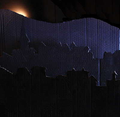
From this I then began to cut out the layers of the image in cardboard. Then Painted them in different shade of grey. I though It helped make each layer stand out from the other. Here is what the model looked like in the end.


I was pleased with how it came out and took some more photos of it. This time I messed around with the lighting to see what kind of effects I can achieve. When we get round to doing it properly I will be able to make use of some studio lighting and have more chances to be more experimental with the lighting.