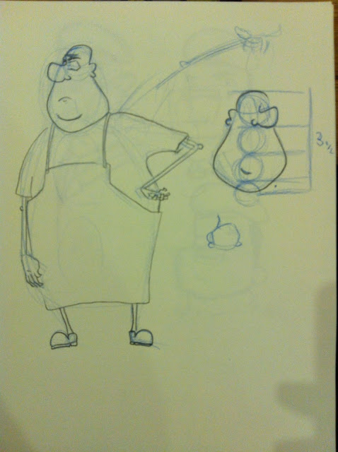
As I have been addressing the issues fed back to me by the director I have begun to develop my earlier designs to look a bit more british so that they fit in the new location of London.
Here is some of the development for Max and Patsy.
Here is a side by side so you can begin to get a feel of the height difference.
Next up was the Grocer. I have settled on the design and did a few expressions as well to help feel out the character a little more.

I have also started brushing up the father design. I will hope to get some feedback from Marc soon.


No comments:
Post a Comment