Monday, 26 November 2012

Week 9 - Pre Production - Tests (Dear Nana) StoryBoarding (Patsy)

A couple weeks ago I jumped on “Dear Nana” as part of the 2D animation team. Working closely with Lydia we are working out how the 2D is going to be produced. This first test was a simple character walk cycle that I did by hand. This was really refreshing to do, as I don’t think I’ve sat down and done something like this since my first year. I liked the way I could plan spontaneous motion while a sketched it out in the planning stages. Although it is a longer process than working within the likes of ToonBoom I think we may need to sit down and finalize the process soon.


I was really pleased with this test and it really helped communicate the character. I tried to push the secondary animation especially on the breasts. I think that after the feedback from others the animation with be toned down a little bit on the next animation test.


I’ve also on a side note been working very closely on the “Patsy” project within the storyboard/animatic phase. We have been going back and forth doing different version as the story has been evolving and also cut back. As marc has been given me his own rough thumbnails of how he sees it I have gone and cleaned the up and drawn the characters within the frame in the right pose and on model as well. This process will hopefully give us a really great polished animatic. 


Monday, 19 November 2012

Week 8 - Pre Production - Character Design (Patsy)

I have been working on the two main characters as one of the points we were given post pitch was that the style needed to be reworked. So i have started to communicated even more so with Kirstianne who is in charge of backgrounds and I came up with some more development work for both Max and Patsy. Here is some of the coneptual work I did last week.

Max

Patsy


I was really pleased with these two and I felt like they had progressed more than the quick designs I had done before the pitch document. But after talking with both Helen and my group together we felt like they still weren't ready. 

Some of the issues that need to be addressed is the hyper perfection of them. They are ment to look like rough street rats in Max's case. Patsy can be a little less rough around the edges but I feel like they both need to have a bit more git. Also WE found that the look fo the trousers was not right. As it did make for a great design feature in theory we came to think that it would be too much to get people to animated to these poofy parachute like trousers. 

So I have been working again on trying to get these characters into the style of the 1940s and also so that they fit into the backgrounds as well. No mean feat but I do love a challenge. 

EDIT:

and after a few changes a began to get some rough versions of the new designs. 


Patsy (Left) and Max (Right)

These designs are a lot more rough and ready than the ones previous. I like the angles and the idea of using simple shapes to build these characters like the triangle based nose that Max has and the square shaped one that Patsy has. Here are some more character based poses for both of them. 


Here are a few turn arounds that I did as well so we could get more of a spacial feel for them both. 
Max posed turnaround

Patsy Turnaround

Max Turnaround


Sunday, 11 November 2012

Production Update

After only just handing in our pitch documents we had to gather our work for the pitch Thursday just gone. I was nervous about it as I hadn’t prepared anything for it yet. I spent the days running up to it building up a few images that I wanted to show to sell my project alongside working on Images for Patsy. 

I was really pleased with how the pitch went. I got some feedback from the judges straight away which was a mixture of neutral positive. Which I thought was alright. The following day we were given our proper feedback and project were given lights according to if they were okay (green) needed more work (orange) or and issues and production would wind up stopping (red)


Unfortunately Poolside was given a red light. This was hard for me to take as I had been working on this for a while and it had become my baby sort of. But form the one to one feedback I got given by the tutors they helped make it clear that it wasn’t the fact that the project was bad it was just not the sort of project they wanted going through into production. They told me it was more of a short short than a short film, which I understood. 

I think If I had the opportunity to go back and redo my pitch I would have maybe put some more dynamic poses for the concept art which may have helped sell my idea to the judges as they had never seen my project before. I will try my best to continue this project in my own personal time and try and make the most out of the situation that I am in. I think it would work as a small short 40-second animation which would be great to put on something like my showreel.

On the positive side Patsy has been given the amber light. One of the main issues that we have been told to address is the design and style. We need to communicate more of the 1940s America. I had a feeling that they would tell us to look into this if we got Pasty through the pitching stage. So I have started to dive more into the research again and look at re designing the characters and we are also looking into re working the backgrounds as well to help display the era and style. 


Also I have already started looking around at the other projects that I want to become involved with now. I have approached Dear Nana and asked if they need someone to work on there storyboards and also the 2D side of the animation pipeline. I have also been approached by Mr Tidbro to do some 2D animating for that as well which mean there will be no rest for the wicked. 


Poolside - Conceptual Artwork


Friday, 2 November 2012

Week 5 - Creative - October Review

So as of today I have just handed in my pitch document for Poolside. It was a stressful week but as least its done and I can carry on developing the project further.


I thought I would take some time to evaluate the first month of being back up to this point. I have been pretty successful in terms of kick starting my own project. It’s been a lot of hard work to cram into this first month. This is due to the fact that I have yet to bring anyone else onto the project. Apart from a few pointers here and there from course mates and tutors this project has been all me. This has been good as I was able to let my designs run wild and crazy and enjoy the time making a project that has been for me. On the down side it has been a lot of work to digest and especially in the run up to this hand in I felt like I could have cracked at any moment.


While this project was in full swing I decide to give myself some extra work to do as I jumped on to Marc Cullen’s project very early on in the design process. I wanted to try and push myself in terms of character designs. It was really interesting to work with someone else again. It was a great opportunity to stretch my design skills as Marc has a very strong idea of what he wanted. Also looking at other artists that I wouldn’t have normally looked at was very helping in developing the character design and my visual style even further. There have been points where I have felt like I had taken on too much work by jumping on this one. But as I take a moment to reflect and evaluate I think it is going to be extremely beneficial in the long run.

The next objectives on my agenda are to carry on developing the thumbnail storyboards alongside with the pitch, which will be happening in just under a week now. I am a little worried about standing in front of everyone as I am used to talking in front of my own class but with the other year groups and also the judges this extra dynamic has made me feel a little worried. But I think with a good amount of preparation most of these worries will fade away.  


I also need to carry on designing for Marc because as of yesterday evening there have been major story changes which involves the need of new characters and old ones to be ditched. All in the name of animation. 

Week 5 - Creative - Character Design/Development (Patsy)

After working closely with Marc last night and this morning I whipped up some designs for his new idea still working within the same time period.  Looking at some of the photos that Weegee took of children and taking them to a graphic feel that would compliment the backgrounds that Kristianne has been working on. 


Week 5 - Creative - Character Development (Weegee)

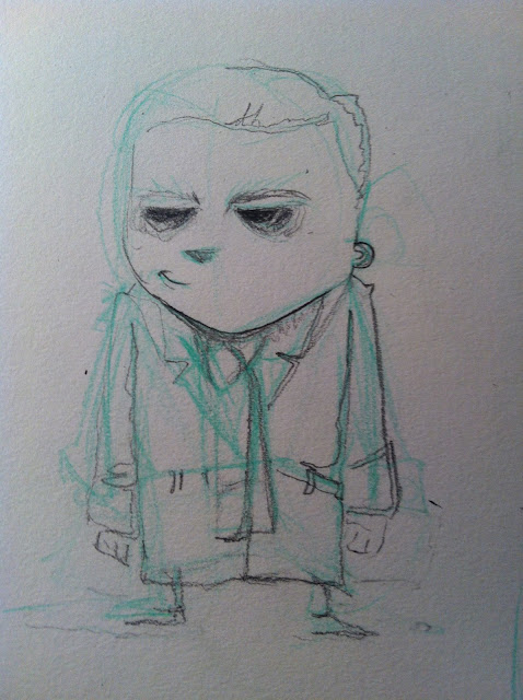
These are some of the last images I produced for Marc's Idea "Weegee" due to the scale he has revised the story and it is no longer including Weegee himself and now centres around two young boys and a night that goes dreadfully wrong. The new story sounds a lot more concise and straight forward. Also there will only be two characters which means I bit more of an easy rid for me.  


Week 5 - Creative - Pitch Document (Poolside)

Poolside - Pitch Document

Week 5 - Creative - Visual Development (Good Knight Bear and Dear Nana)

I thought I take a moment to post up a couple drawings I did for both Alice and Lydia. Alice was stuck on her bear designs and I did a handful of versions to help her free up her mind so she could work out what she wanted the big thug like bear to look like. As for Lydia I just did a simple sketch to show how a pose can make a character work and come to life more.