Monday, 28 February 2011

Environment Project (A.K.A: My Battle With Maya)

So my Maya Environment Is really kicking into gear now. Here is the image I am trying to base it upon. It is the Green Room within the Performing Arts Centre.


I really like the lighting in this scene and thought it would be an interesting challenge. So here are some of the fist shots of what it is turning out to look like.


This is the first simple render I have done of the scene. I am really pleased with it. It's not much but at least its on its way to looking like the real thing.

Sunday, 27 February 2011

Working On My SketchBook

Okay so I've been trying a few more perspective sketches. This time I tried to do one in a different medium. Here I messed around with watercolours. It was fun , although I don't think I got the perspective right but I think it works okay.


I also tried another one like my first draw in just pen. This I think is really good and definitely feels like its coming out off the page. If I would have drawn it bigger I would have been able to put more detail into the people on the pencil. But I am happy how it is.

Friday, 25 February 2011

UPDATE: SketchBook


I also decided to try some Disney Sketches and here is a few I have been working on today. I think they worked really well.


Wednesday, 23 February 2011

Flash Animation Project : Pre-Production Part 4

Here is a turn around of my Main Character Owl. I think it works really well in 3D space and I can't wait to start animating.

Flash Animation Project : Pre-Production Part 3


So this morning I have been working on my backgrounds. I wanted the owl to be interviewed in the trees at night. To go with the theme of the "Nightlife of Falmouth" So I had a little search round to find some references of trees at night.


From these Images I was able to get an idea of what a tree would look like if I was to design it at night. I thought I would use mixed media to create my background. So I sketched out the idea and then took my trusty Watercolours to it. I was really pleased with the out come.


After taking the images into Photoshop this is where it began to get interesting. I cut out the images and arranged them in layers. From which I could give certain branches different levels of blur as if the animation was actually being caught on a real camera. I am really liking this background and think that I might work on it more. Although I like it as it is.

Final Colour Concept


Flash Animation Project : Pre-Production Part 2

Here are another couple ideas that I have been working on as well. I chose the interesting topic of having and old-fashioned telephone talking about smarts phones and maybe iPhones. I thought It would be an interesting animation. So I did a sketch within Photoshop.


Also I came up with the idea of making a crow out of lots of lines. I thought that the design looked really bizarre but fun and quirky. Not entirely sure as to what the animation could be about if it was a crow but I am sure I could find an idea to fit around it.

I went back to my telephone sketch and thought I would do a simple design test with Flash where the animation would be produced. I think this works really well. Although I think that the face looks somewhat wrong. But I think that the whole design kinda carries it and makes it look believable.

Having asked a couple people about the designs that I have done I got the most responses from the owl design. So I am going to carry on my first idea and work on some ideas of what the background could be.


Tuesday, 22 February 2011

Flash Animation Project : Pre-Production Part 1

I loved the idea of the project from the get go. So I decided to start off by putting some ideas down on paper.

I think all of these would be great ideas and would make for a very interesting flash project. But I decided to develop a couple. Firstly I decided to try the owl. This is kinda tricky for me as I’m not the best at drawing animals. So I tried to do what Curtis Jobling told me at Bradford and keep it simple. Using simple shapes. So I did and came up with some interesting versions of an owl.


I think they all worked really well. So I did a full watercolour painting of the final version of the owl. Which I am really pleased with.


Monday, 21 February 2011

WHAT TIME IS IT!?! Motion Graphics Time!

So! Yeah! This is it! I'm really happy with the final outcome. I love the color. If i was to add to it I would have put some more faces faling from the sky maybe , but I kinda like it as it is.

Sunday, 20 February 2011

One From The Archives 4 Years Old!

I was looking though my old sketchbooks from school and spotted this drawing I did around 4ish years ago:

I used to love it. I had such great character. But I always though she looked stiff and 2 dimensional. So I tried to reinvent her in a new modern style which I have developed over the years


I'm really impressed with it. I feel like there is more emotion in this one and it feels sexier too. Might have to go through more of my sketchbooks and try this again.

Thursday, 17 February 2011

SketchBook: The Heinrich Kley Project

So we are having to come up with some pieces of work based on Heinrich Kley. A man who made average object larger than life which is a very handy idea to use within animation and interesting to help capture a style. So I decided to give it a go. I am really enjoying it. Here I took a pair of high heels and made them as high as skyscrapers with people scaling them and ladders at the base. Which is very similar to the way Heinrich Kley did his work.

Experimental Animation

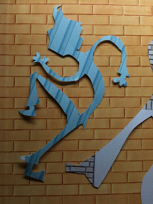
Okay, so I've been really stumped on ideas for this project. Nothing was work and nothing was inspiring me. Then yesterday evening I was looking at my notebook. It was a gift from a work colleague and it has walls on the pages as if you were making graffiti on it. And it hit me. I could do cut out animation with the pages I wasn't using. I plan to do figures dancing on loop to different beats. Building them up. I started testing it out and it's working really well. Here is some of the figures I have been cutting out of my notebook.


Monday, 14 February 2011

New Model , Fresh New Drawings

I am enjoying this model now. A lot more curvy. Shame she couldn't do any extreme poses due to injury but i'm sure she can do some good poses. Here's hoping.


Thursday, 3 February 2011

LIP SYNC

I think I am beginning to get a hang of this lip sync. Even though it is still pretty rough I think It works really nicely. I think I'm gonna add some more detail to the mouth poses. Then it's on to arms and the rest of the face.


Wednesday, 2 February 2011

Beautiful Landmark in Disney History - Tangled

Right! So I got back from watching Disney's 50th Animated Motion Picture "Tangled" It was Beautiful. Some of Glen Keane's Best work to date. I fell in love with the design of Repunzel. Strong willed and yet soft and vulnerable at the same time. It is definitely worth going and checking out this latest effort by Disney. Even is delightfully stereotypical and wonderfully Clichéic.


Tuesday, 1 February 2011

Winding it Back to the 50s

Drawing inspiration from 50s Pin Up Girls I decided to do a quick sketch. I really like the expression I achieved with this picture. It looks very....seductive. Which is good.

One Hell of a Mind Fuck!

Having Fun with AfterEffects results in one hell of a mind fuck. Now this I would love to be played at Q Bar and see how meny people begin to trip out. Its been fun getting back into AfterEffects and I am looking forward to what I can create for this up and coming brief.